


NASA AR Interface System
SKILLS:
Augmented Reality Design
Human Centered Design
Interaction Design
Systems Thinking
UI/UX
Navigation Team Lead
User Research
User Flows
Wireframing
Iterative Prototyping (Figma + Unity)
HITL (Human In the Loop) Testing
Usability Testing
+ my role
Awarded 1/10 national finalists for NASA S.U.I.T.S. Challenge to design an augmented reality HUD (Heads Up Display) interface system to assist astronauts in completing lunar spacewalks on future NASA Artemis missions.
TYPE:
Club, Team
(11 Designers
+ 5 Developers )
TIMELINE:
Sep 2022 -
May 2023

THE LAUNCHING POINT
NASA S.U.I.T.S. (Spacesuit User Interface Technology for Students) is an annual challenge that invites university students across the country to propose and contribute interface design solutions for the spaceflight needs of future Artemis missions.
The RISD Space Design Club competed in the 2023 Challenge. We were tasked to design and develop an Augmented Reality HUD (Heads Up Display) interface system that can assist astronauts in completing lunar spacewalks.
There are 4 main parts to the lunar spacewalk:

Egress
Our interface must communicate a set of procedures the astronaut is required to perform in a correct sequence to prepare their suit and exit the airlock safely.

Rover Command
Our interface should enable the astronaut to direct and recall the autonomous rover to a specified point of interest.
Navigation
Upon exiting the airlock, our interface must guide the astronaut across the lunar site to complete mission tasks at points of interest and safely return to the lander, while tracking terrain anomalies.

Geological Sampling
Lunar rock samples are scanned using an RFID tool, and their information is collected, displayed, and stored in our interface.
Challenge accepted.
As the Navigation Team Lead, I piloted the research, design, development, and testing of these features.
Going beyond these core responsibilities, I also managed how each of the four subparts of the spacewalk listed above would integrate into one coherent product system.
KEY RESEARCH INSIGHTS
We began by learning from the experts.
Insights from interviews with specialists in pertinent fields conducted through the 2020-22 challenge became our launching point.

James H. Newman
Former NASA Astronaut


Steve Swanson
Former NASA Astronaut

Isabel Torron
NASA UI/ UX Designer
Alejandro Romero
XR Specialist

James Head
Geologist

James Russel
Planetary Sciences

Peter H. Shultz
Geologist

Jonathon Levy
Cartographer
We discovered some of the primary obstacles to performing activity in extreme environments like the moon that would be critical for our design to address:
1
Limited visibility and disorienting environment.
Harsh lighting conditions make the lunar surface appear homogenous, making it significantly more difficult for the astronaut to perceive distance, depth, and identify terrain anomalies like hazardous craters or sharp rocks.

2
High risk of cognitive overload.
Multi-tasking under the high pressure and time-sensitive nature of lunar missions is taxing, making attention a limited resource.
-
"Be as minimal as you can. It may not be best for all controls (on the interface) to disappear, but it can be helpful for organization." [Levy]

3
Limited mobility.
The heavy, pressurized suit and constricting gloves (in addition to absent gravity) make it difficult to grip, make gestures, and walk.
-
"With bulky gloves, there's no tactile feedback." [Swanson]
-
"The main challenge is the gloves because they are airtight and large, so mobility is tough." [Torron]


IDENTIFYING OUR DESIGN REQUIREMENTS
In response to the challenges identified above, we laid out some guiding fundamentals for our design.
1
Clear task hierarchy.
Ensure clarity in communication to minimize accidents by streamlining information, sequencing procedures, and aligning task hierarchy with visual hierarchy.
2
Minimal, unobstrutive design.
While the astronaut is moving, keep their field of vision clear. This also means no elements should map onto the ground the astronaut is walking on.
3
Assist spatial awareness.
Track terrain anomalies, points of interest, and enable self-location.
4
Prioritize simple, big hand interactions.
Account for the astronauts limited range of motion.
5
Cohesive design system, functions and gesture triggers.
Reduce cognitive load by maintaining consistency across the interface.
Therefore, our goal became:
How might we effectively assist the astronaut through lunar EVA mission tasks, procedures, and harsh terrain while minimizing risk and ensuring communication clarity and efficiency?
THE DESIGN SOLUTION
We developed our final design with Unity and Figma for the HoloLens 2.
Our final design was tested by NASA design evaluators during testing week on the Rock Yard at NASA Jhonson Space Center, and presented to NASA panelists.
1. EASY ACCESS PALM MENU

Swift and simple.
Available at the flip of the hand, accounting for limited tactile mobility and task efficiency.
NASA design evaluator (DE) Kelly Mann accessing our menu

2. EGRESS


Procedure error notification
Communication clarity.
A telemetry stream connects the egress interface to the UIA (Umbilical Interface Assembly) panel.
Tasks automatically advance when the corresponding action on the UIA panel is confirmed.
-
Step-by-step guidance ensures proper sequencing of procedures.
-
Visual confirmation of completed procedures is enabled with the color green, checkmarks, a progress tracker, and confirmation buttons.
-
Located off center screen ensures vision of the UIA panel is not obstructed.


DE Kelly Mann testing egress on-site at UIA panel
3. NAVIGATION
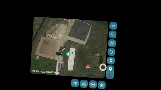
( Designed for the map of NASA Rockyard Testing Site )
_edited_edited_edited.jpg)
Breadcrumb Trail Points automatically drop every 10 meters at the astronaut's GPS location.
Navigational Paths
are drawn to next selected destination.
Custom Point Action Menu
Press onto a Point of Interest to reactivate and edit point location, delete point, or attach a voice note of any observations made at that location.
Modified Compass System
Aligns with lunar mission landmarks rather than inconsequential Earth cardinals
Map Zoom In + Out
Self Center
Breadcrumb Trail
Show / hide the route just walked
Rover Command
Direct rover to a point dropped on the map
Custom Point of Interest
Drop to record the location of self-identified interest points outside of those pre-appointed by NASA
Custom Hazard Point
Drop to record self-identified terrain anomalies outside of those pre-provided by NASA

_edited_edited.jpg)
.png)
.png)
Astronauts kept in the know.
-
Functions are visually hierarchized. Eg. when not in direct use, the compass sits slightly above the user's field of vision. When desired, a simple, slight head tilt brings it into direct line of sight.
-
The unforeseen is accounted for with a flexible interface. The astronaut can record locations and notes for unexpected interest points and terrain anomalies.
-
Spatial awareness is prioritized. Hazards are highlighted, self-location and movement is recorded, and the modified compass emphasizes position relative to landmarks.


Open + Close Map with Button on Palm Access Menu
4. ROVER COMMAND

"Go fetch!"
Integrated into the navigation module to equip the astronaut with knowledge of all rover movements.
Deployment confirmation and progress tracking displays when the rover is en-route.
For a clearer recording, the palm access menu is displayed as on-screen buttons on the video above

Rover Recall Button on palm access menu
DE Kelly Mann inputs a rover point and the rover move to it.
5. GEOLOGICAL SAMPLING

Rock-solid data.
Visual confirmation with the color green and growing sample count enforces cognitive awareness.
Streamlined communication with simple informational elements enforces procedural clarity.
Geological Sampling Button on Palm Access Menu to Begin / End a Session

DE Skye Ray using the RFID scanner on a sample rock
PROCESS OVERVIEW
01
02


03
04
05
06
07
08
Discover Research Insights
& AR Capabilities
Analyze Interface
Needs
Ideate
Iterative Prototyping
User Testing Desireability & Accessibility
Development on Unity
& Hololens2
Field Usability Testing
of Functionality
Test Week
at NASA
IDEATION

Navigation Userflow Version 1 (click arrows to horizontally pan)
As someone who thinks in systems, this significantly helped me work out the functions I wanted to incorporate and our user's interaction path.


ITERATIONS GALORE
With our understanding of NASA mission requirements and user challenges, we launched a highly iterative process to design an interface system that catered to these needs.
We developed our design in 6 main phases with multiple rounds of user and usability testing between them, and constant communication with our team developers and NASA UX mentor.
.png)
Stage 1
Wireframed ideas, roughly laying out ideated features.
Stage 2
First low fidelity prototype with MRTK2 (Mixed Reality Toolkit) assets, and adapted to the Hololens2 field of view.
Stage 3
Further developed interface functions.
Here we discovered the limitations of MRTK assets for design flexibility and accessibility in harsh lighting conditions.
.png)
.png)
.png)
Stage 4
Streamlined system to incorporate rover command in navigation.
Created custom assets to improve contrast and readability in dark environments.
Conducted user testing at this stage and was the first iteration we handed off to our developers.
Stage 5
Used feedback from user testing to reprioritize and consolidate features after identifying redundancies.
Improved interface interactions to facilitate intuitive actions.
Conducted usability testing at this stage, and worked on technical issues identified with Unity processing and telemetry streams.
Stage 6
Took our design to testing week at NASA.
Used feedback to make revisions emphasizing clarity and quicker access to functions.
Presented our validated interface to NASA panelists.
%20(1).png)
.png)


HUMAN IN THE LOOP (HITL) TESTING
PHASE 1: USER TESTING
We first conducted rounds of user testing with 5 faculty members aged 25-50 years.
We asked them to 'think out loud' as they navigated through our interface on Figma's desktop prototype mode so we could study their habits and evaluate how intuitive our UI and access to functions were.
Here our the main changes for navigation that resulted from this:
01
Reprioritize + consolidate features.
02
Reduce the number of 'clicks' and menus in time-sensitive settings.
-
Rover command was integrated into navigation since both were supported with the same location data.
-
Users did not find value in filtering visible map points since points were minimal to begin with, so this feature was removed.
-
A self-center button was added since users found awareness of self-location extremely useful.
-
Point name tags replaced the drop-down location list previously used to locate points on the map.
-
All point interactions (edit, delete, add note) can be done from one place by simply tapping and reactivating the point.
-
Buttons to add custom points are no longer embedded in a menu.
-
Waypoints are now automatically dropped.


03
Improve icon clarity.
-
Users had difficulty distinguishing between custom added points and NASA pre-provided points on the map.
-
We differentiated them by color. Additionally, when custom points are tapped on in the map, they highlight in a green consistent with the self-locator icon.

PHASE 2: FIELD + USABILITY TESTING
Our developers used the MRTK3 Unity API with Figma Bridge to bring our prototypes into Unity and onto the Hololens2.
Designing in constant communication and in sprints with our developers, we learned how to rework our designs to operate within MRTK3's capabilities and better utilize functionalities such as gesture recognition, body part recognition, spatial mapping, and object manipulation.

We conducted two rounds of field testing at local parks simulating the harsh lunar environment.
We tested in pitch-black with the exception of two extreme light sources, and on uneven terrain.


Through these tests, we further iterated upon and validated that our UI elements such as colors, icon sizes, and fonts performed well in dark lighting.
We also identified and worked through challenges with our functionality such as errors in spatial mapping, our connection with GPS system and telemetry stream data, hand gesture recognition, and object collision.
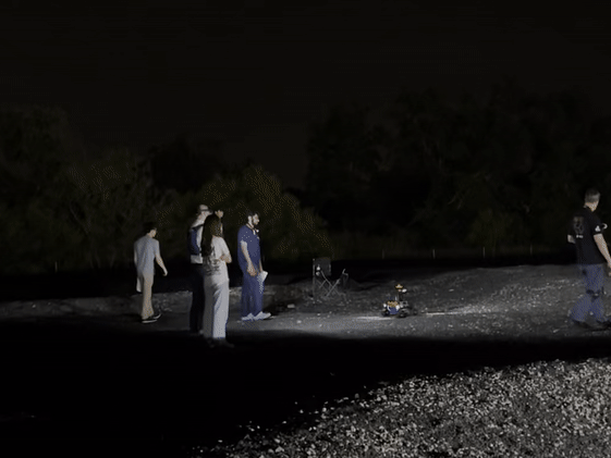
PHASE 3: TEST WEEK AT NASA
Our team was invited to test and present our design at the Johnson Space Center in Houston, Texas in the last week of May 2023.
Our on-site testing was conducted in two separate rounds by two design evaluators, Skye Ray and Kelly Mann, on NASA's Rock Yard which simulates the lunar surface.

Our developers connecting our design to NASA's telemetry stream.

Arriving at the Rock Yard.


Briefing Kelly Mann on our interface.
Skye Ray debriefs and gives us feedback on our design.
Skye Ray navigating with our interface.
Both of our design evaluators provided us with detailed feedback on the successes and pain points of our design. With their suggestions, we made a final round of edits to our interface.
Here are the main changes we made to navigation:
01
Add coordinates of points of interest to map.
The location of a POI clicked on is specified and made clearer by displaying it's coordinates at the bottom of the map.

02
Clarify asset imagery.
The obstacle and waypoint icons were modified.

03
Revise custom point placement interaction.
When adding custom points to the map, it wasn't clear if the icon had been successfully picked up from it's button to add to the map. As a result, we added an in-between hover state that would drag with the user's finger.

Testing week concluded with a presentation to 5 NASA panelists.
We received feedback that our design was very intuitive and communicative, and they praised the extensive user testing we conducted throughout our iterative process.
Our team was awarded as 1/10 national finalists for the 2023 NASA SUITS Challenge.

FINAL USER FLOW
Streamlined for quicker access to more functions with fewer actions.
(Click arrows to horizontally pan. Click on image to expand.)


THE VISUAL DESIGN SYSTEM
This system places emphasis on:
-
Contrast for visibility in low lighting conditions.
-
Clean, minimalistic design for clear and quick communication.
-
Visual feedback to interactions so the astronaut has confidence in every action executed, especially in a high-pressure and time-sensitive environment.


Primary components used
WHAT'S NEXT ?
On to the next challenge!
Our team is competing in the 2023-24 SUITS Challenge, this time designing an AR interface for a new EVA on Mars.
This year, I am leading the project as the Chief Designer.
With a much larger 15-person development team (compared to 5 for 2022-23), here are some capabilities I'd like us to explore with our new design:
1. 3D terrain mapping to highlight points of interest and obstacles in real space.
2. Navigation paths to POIs in real space if NASA provides earlier access to the relevant location data.
3. Photo feature for geological sampling to take and store snapshots of rock samples.
4. Intact backup systems to gesture and voice recognition, particularly important in low-network areas and mission-critical scenarios.
REFLECTING ON THE JOURNEY
My top learning takeaways from this project:
1
Design priorities change when creating for AR.
We were no longer just designing for a 2D screen but in 3D space. When our interface hovers at a distance in front of our users, visibility and readability become critical considerations.
Ample time must also be reserved for user and usability testing to tackle unpredictable challenges.
2
Efficient design for time sensitive, high cognitive load environments.
I learned how to streamline a product system to communicate information clearly and quickly by ensuring functions are easily accessible, redundancies are removed, and UI is minimal and functional. I also understood the importance of embedding action and interaction confirmation across the interface to invoke user confidence.
3
Cross disciplinary collaboration with developers.
I learned to work closely with our developers in co-design sprints.
While ensuring my design ideas were effectively communicated with interactive and annotated prototypes, our conversations were also pivotal to ensure we not only operated within the bounds of, but also leveraged MRTK3 capabilities.
4
Leadership.
As the Navigation Team Lead, I gained experience with coordinating across a larger team.
Beyond my core responsibility to create navigational functionality, every week I facilitated conversation to ensure all our sub-team leaders were aligned, kept track of our hand-offs, and worked on integrating each of our mission sections into one cohesive interface system.

